
The element "Contacts" (Pro)
Pro version. The element Contacts belongs to the Pro version of Contact Directory.
The element "Contacts"
The Pro version comes with a builder element of its own. It shows one or more contacts with every detail a Joomla contact has: image, name, position, category, address, phone and mobile as links that dial, fax, e-mail address (cloaked against spam bots), website, miscellaneous information, tags, each custom field on its own, the contact's links, and buttons for the vCard and the contact form.
In the builder you find it under Add Element in the group Graup-IT.
Four layouts
In the tab Content, Layout chooses how the contacts appear. Each layout brings only its own options to the tab Settings; what applies to a contact – image, name, position, details, links and buttons – you set once for all of them.
| Grid | Cards side by side: columns per screen width, gaps, divider, card style and padding as in YOOtheme's grid, optionally with a filter. |
| List | One row per contact, the image beside the text: list style (divider, striped), size and columns as in YOOtheme's list, optionally with a filter. |
| Table | One row per contact, one column per detail. Style, hover highlight, size, alignment and the behaviour on small screens (scroll or stacked) as in YOOtheme's table. Optionally with a search field and sorting by clicking the column header. |
| Directory | Contacts grouped by initial or category, with a jump bar. Each row shows name, position and the first details; the rest expands. |
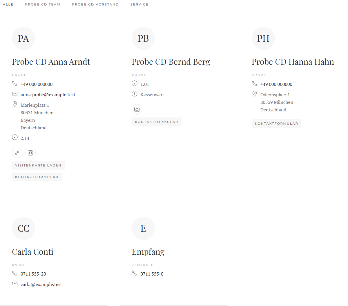
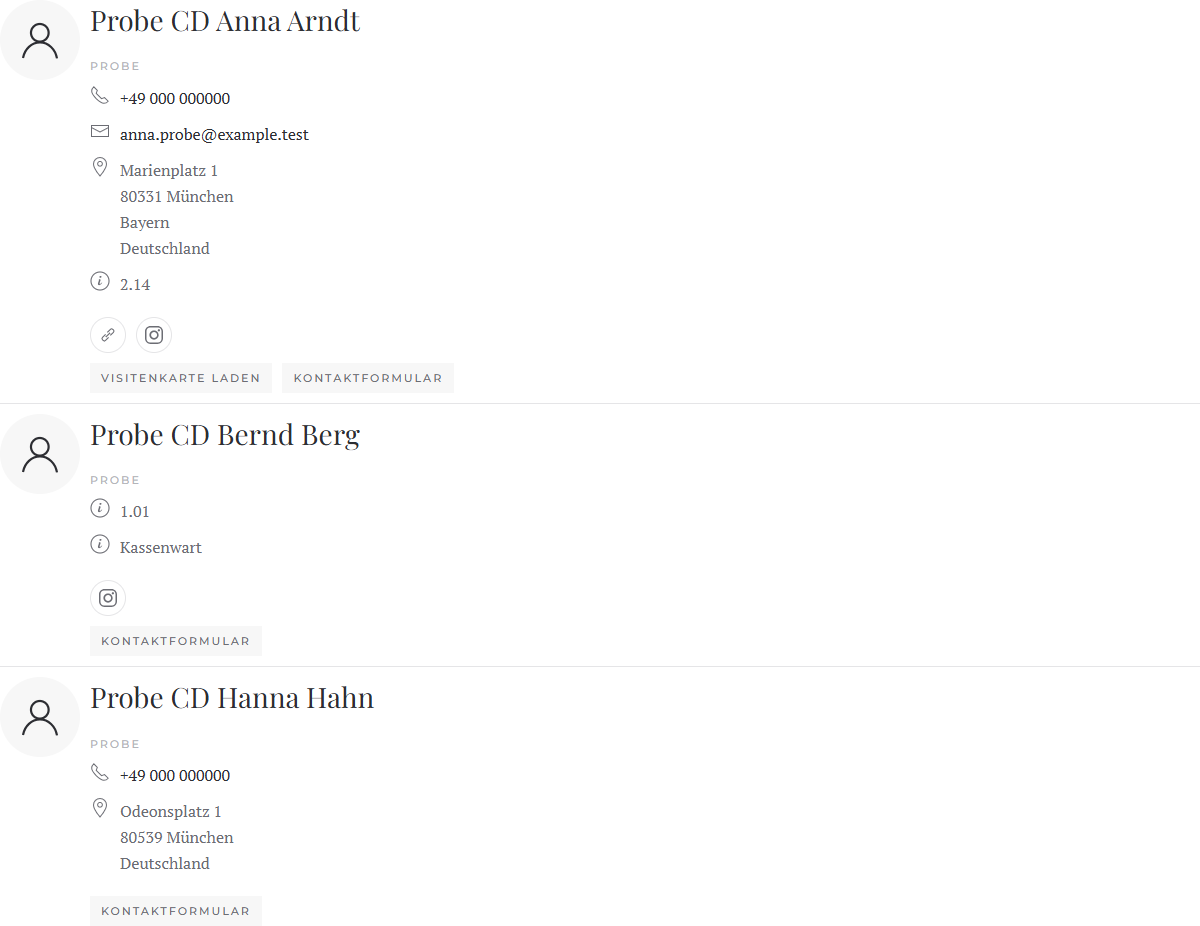
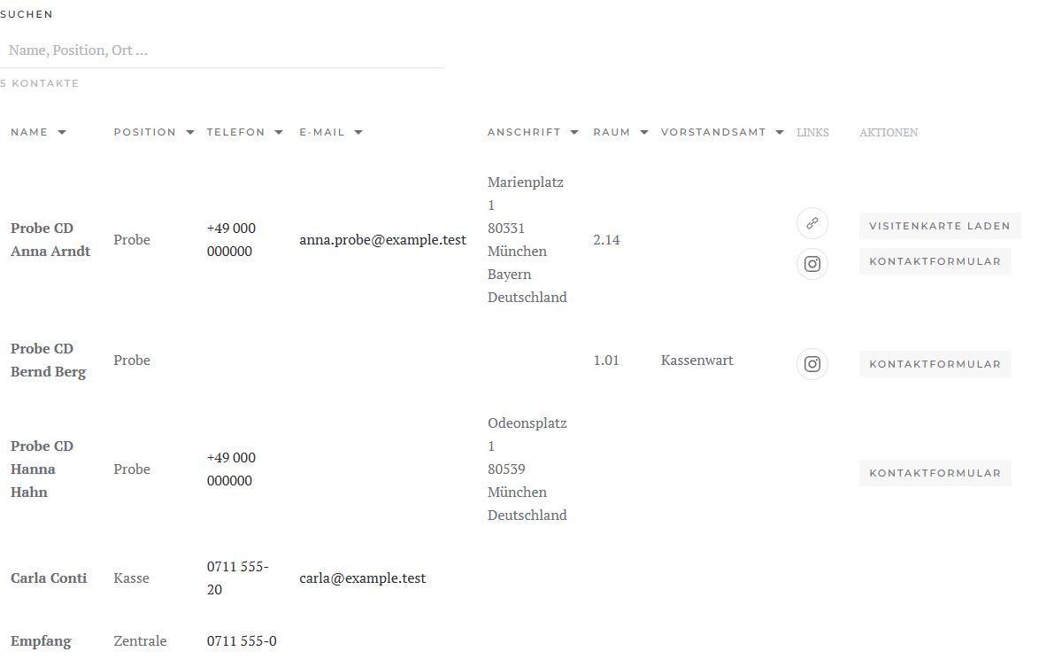
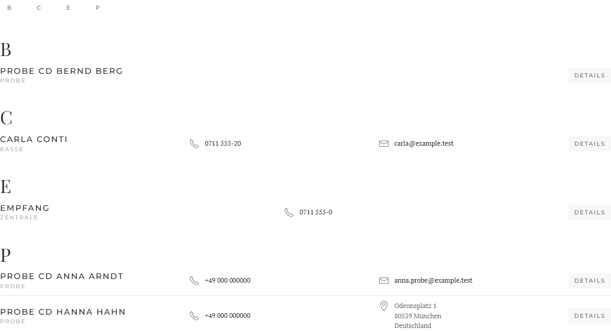
Filter by category
Grid and list can show a filter with the categories above the contacts (or to their left or right), as in YOOtheme's grid: All and one tab per category. A click hides the other contacts, by keyboard too. If an entry has a category of its own, it counts instead of the contact's.
Contact without image
Under Image › Without Image you choose what shows for a contact without an image: nothing (default), the initials or a person icon.
Choosing single contacts
- Put the element Contacts on the page.
- Open an entry and choose the contact at the top under Contact.
- For more contacts, add more entries.
You need not fill in name, position, image and link: left empty, name, position, image and contact page come from the contact. What you enter yourself takes precedence. An entry without a contact shows only what you enter.
The entry's tab Contact holds phone, mobile, fax, e-mail, address, website, category, miscellaneous and tags as fields of their own. Left empty, the detail comes from the contact; a value of your own – entered or mapped with Dynamic Content – replaces it. So entries without a contact show these details too, for example from articles or other sources. The contact's display options do not apply to values of your own.
Several contacts from a source
- Open the entry and choose, under Dynamic Content in the group Contacts, the source Contacts (or a related source) with the filters you need.
- Done: when the source returns contacts, the element takes the contact from the source on its own, with name, position, image and all details. The field Contact stays unmapped; that is as it should be. Map name, position or image only if you want to show other fields there.
If you map the field Contact yourself, your mapping applies. With a source that returns no contacts (such as articles), the element maps nothing.
The element loads the details of all contacts with a single database query.
Tab "Content": which details show
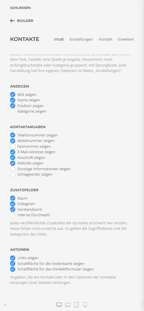
| Display | Image, name, position and category. |
| Contact Details | Phone, mobile, fax, e-mail, address, website, miscellaneous information and tags. |
| Custom Fields | Each published custom field of the contacts with a switch of its own (see below). |
| Actions | The contact's links and the buttons for the vCard and the contact form. |
Details that a contact or the options of the contacts hide never show in the element, whatever these switches say (see Fields and display options). Contacts the visitor may not see (unpublished, other access level, other language) are left out.
Custom fields
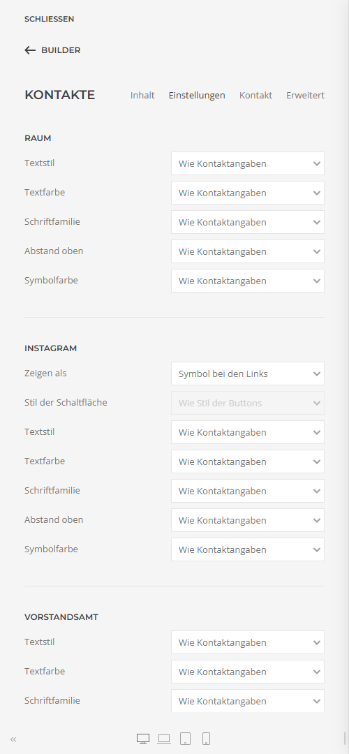
Each custom field you created and published under Contacts › Fields appears in the element as a detail of its own – with a switch, a group of its own in the tab Settings, and icon and position in the tab Contact. New fields appear by themselves and are off at first. If you rename a field, its settings stay.
- What Joomla sets for the field applies: its access level (a guest does not see a field for registered users only) and its categories (a field for one category shows only for contacts in that category).
- If Edit Custom Fields is off in the options of the contacts, the element shows no custom fields – provided Respect Display Options is on in the plugin options.
- Empty fields are left out.
A field of the type URL can show in three ways, chosen in its group under Show as:
| Detail | Like any other detail, with the link Joomla renders. |
| Icon with the links | As an icon in the row of the contact's links, after link A to E. The icon follows the address, for example Instagram, LinkedIn or YouTube; otherwise a link icon. |
| Button | As a button after vCard and contact form, labelled with the field's name, optionally with a style of its own. |
Elements of earlier versions in which "Show the custom fields" was on show each field published at the time of the update on its own afterwards.
Tab "Settings": the design
At the top are the groups of the chosen layout (see Four layouts), then the parts of a contact, the same in every layout, and last General as in every YOOtheme element.
| Image | Width and height, loading, border, shadow, link, alignment to the text and what shows without an image. |
| Name | Style, link to the contact page, hover style, font family, colour, HTML element and margin (these two only in grid and list). |
| Position | Style, colour, place above or below the name, HTML element and margin (these three only in grid and list). |
| Contact Details | Display as a list or as a description list (label left, value right), label as icon, text, both or none (kept for screen readers), style and width of the label, list style, spacing, text style, top margin, colour and size of the icons. |
| Per detail | For each detail and each custom field switched on, a group of its own: text style, text colour, font family, top margin and icon colour. "Like contact details" takes the common settings. For telephone, mobile and e-mail, Link switches off that the detail is linked to call or to write (default: linked). |
| Under Show as the Address among the details or an E-mail Button after the vCard and the contact form, with a style of its own if you like. In both cases the address stays hidden from spam programs. | |
| Links | As icon button, icon or text, size and gap. |
| Buttons | Style, size, full width and alignment; vCard and contact form optionally with a style of their own. |
Tab "Contact"
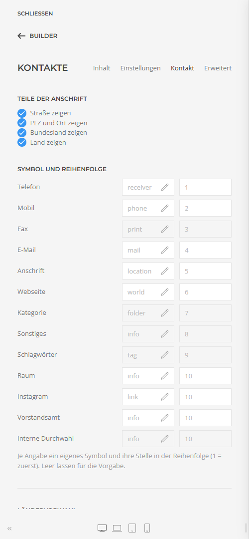
| Parts of the Address | Switch street, postcode and city, state and country on or off one by one – for example only the city in the table. |
| Icon and Order | For each detail and each custom field an icon of its own from YOOtheme's icon picker and its place in the order (1 = first). Left empty, the default applies; custom fields then follow the other details. |
| Country Code | Phone numbers without a country code (e.g. 0711 12345)
are dialled with this one, e.g. +49 for Germany. |
| Structured Data | Describes the contacts shown for search engines (schema.org Person). The e-mail address stays out. |
Directory
The initial comes from the contact's Sort Field 1 (usually the last name), otherwise from the name; umlauts stand with their base letter. The jump bar shows only the groups in use, or A–Z with empty letters greyed out. How many details stand right beside the name, and whether the rest expands, is always visible or is left out, you set in the group Directory.
Elements of earlier versions
Elements created with an earlier version are converted by Contact Directory when they load, from whichever version: settings with the same name stay as they are; video, hover image, lightbox and the text in an entry's field Content are dropped, as they do not fit contacts. Save the page once in the builder so the conversion lasts.
Applies to version 1.0.0.